Illustration Research

Led research and testing to provide directional guidance for the creation of a new illustration style
Overview
Opportunity
As part of a large rebranding and redesign effort we have been hard at work to develop an illustration style that closely aligns with our brand attributes. Brand consistency in addition to an increasingly more usable website is all part of our goal to build trust with our users and show them that we are their passionate healthcare advocates.
Deliverables
I researched and tested a wide variety of illustrations against our brand attributes. I presented my findings to the team of illustrators as directional guidance.
Tools: Adobe Lightroom, Excel, SurveyMonkey
The details
Research
I conducted competitive research on over 50 sites: Healthcare, Finance, Insurance, Journalism, “Northwest” and other "modern" websites
Pulled 40 illustration styles, culled them down to 17 options to test against brand attributes
Included “inspiration” styles from other design teams: brand creative and mobile


Test
I chose a singular topic (woman) to make testing consistent. Caveat: Research suggests women are seen as more accessible. Racial bias could also play a role.
Determined a test plan based on brand and anti-brand attributes
I created A/B survey on Survey Monkey
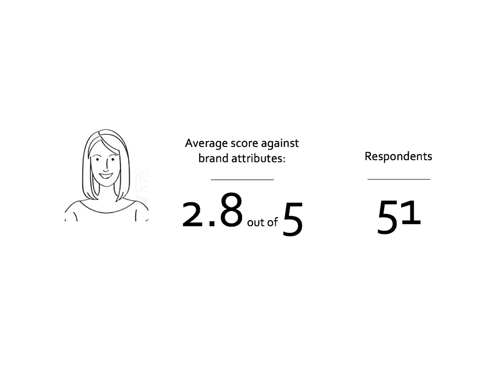
50 +/- respondents per illustration, each saw only one image
938 total respondents
Questions
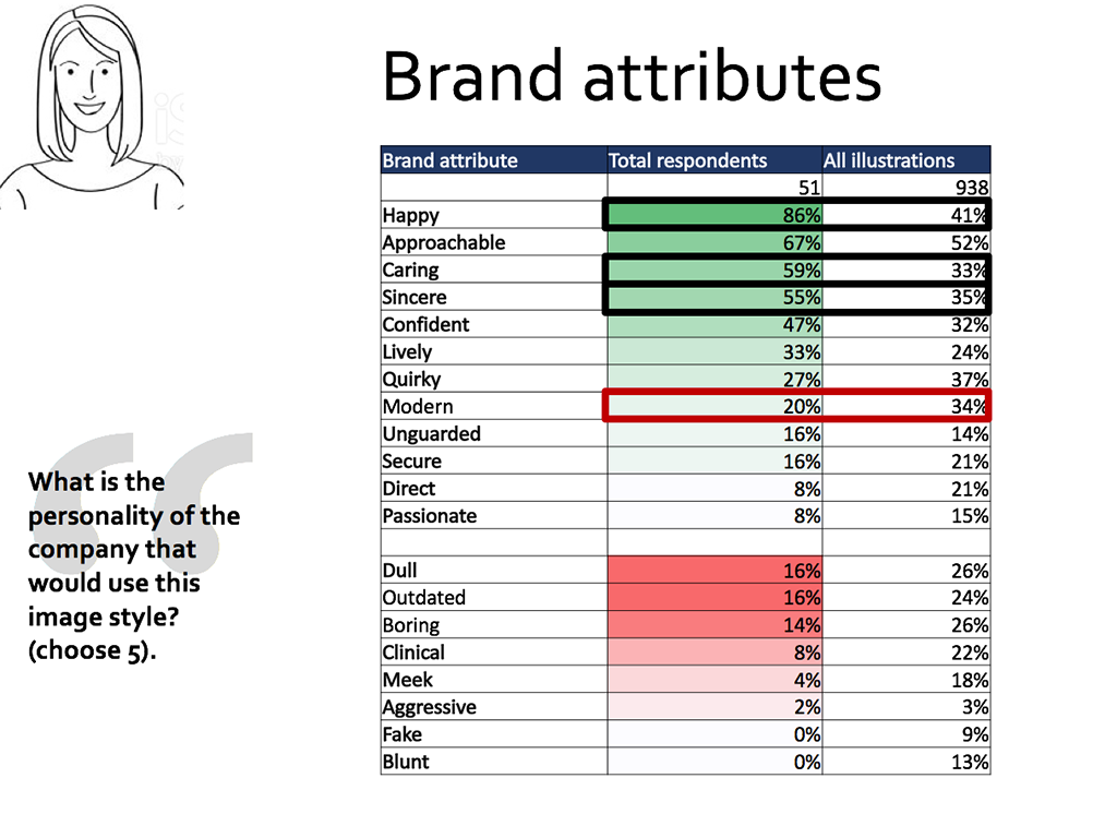
1. What is the personality of the company that would use this image style? (choose 5)
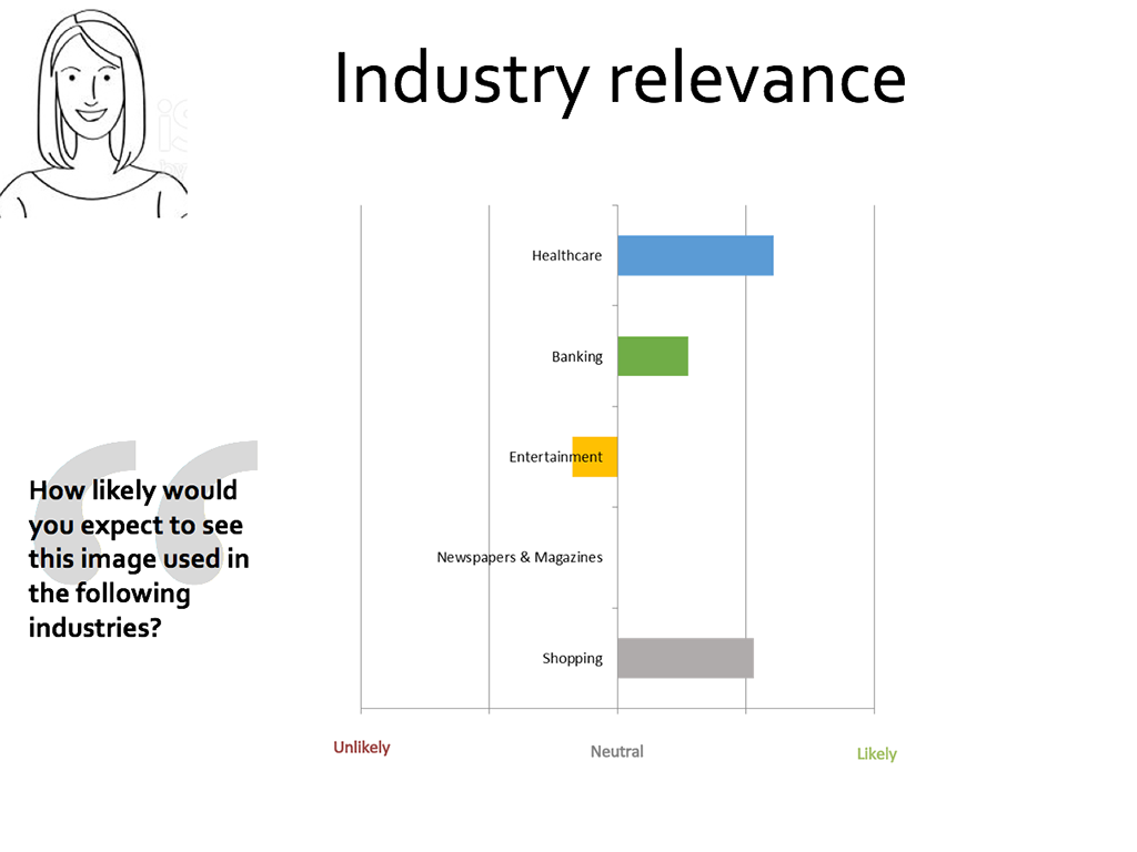
2. How likely would you expect to see this image used in the following industries? (Healthcare, Entertainment, Banking, Shopping, Magazines & Newspapers)
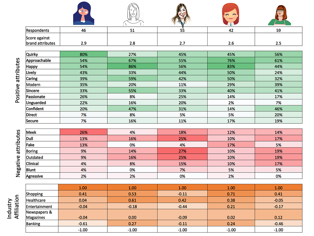
Results
I broke the results down by the top 5 results based on affiliation to our brand attributes. I also included a complete break down of the rest of the test candidates to provide more complete context.
Next steps
The illustrators have been developing a style based on the example most affiliated with their brand attributes. Together we've explored the various use cases for illustrations in our products and continue to refine the style as the broader redesign is fleshed out. Our aim is to be as consistent as possible, developing a style guide that we can all work from as well as share with vendors who are developing illustration in different projects for us.
We've continued to develop and set up framework for the illustrations moving forward where we consider:
Use cases (web, mobile, brand)
Types (icons, spot, scene)
Framework (line, perspective, shading, level of detail)

The beginning of the Illustration framework
Reflection
The wins
Throughout the year this project has been a great opportunity for the web, brand and mobile teams to collaborate and improve our relationship. There is nothing like having a shared goal and doing some extreme negotiation on a very subjective subject. We learned out more about a wider variety of use cases and are better partners for it.
What could have gone better
Initially the timeline for this project was not completely aligned and our brand partners got the wrong impression that research and testing takes too long (the eternal battle). I adjusted by clarifying the schedule and providing a full report on the agreed upon date.
See other projects:

Premera rebrand and redesign (UX/UI)